Translating the Dashboard
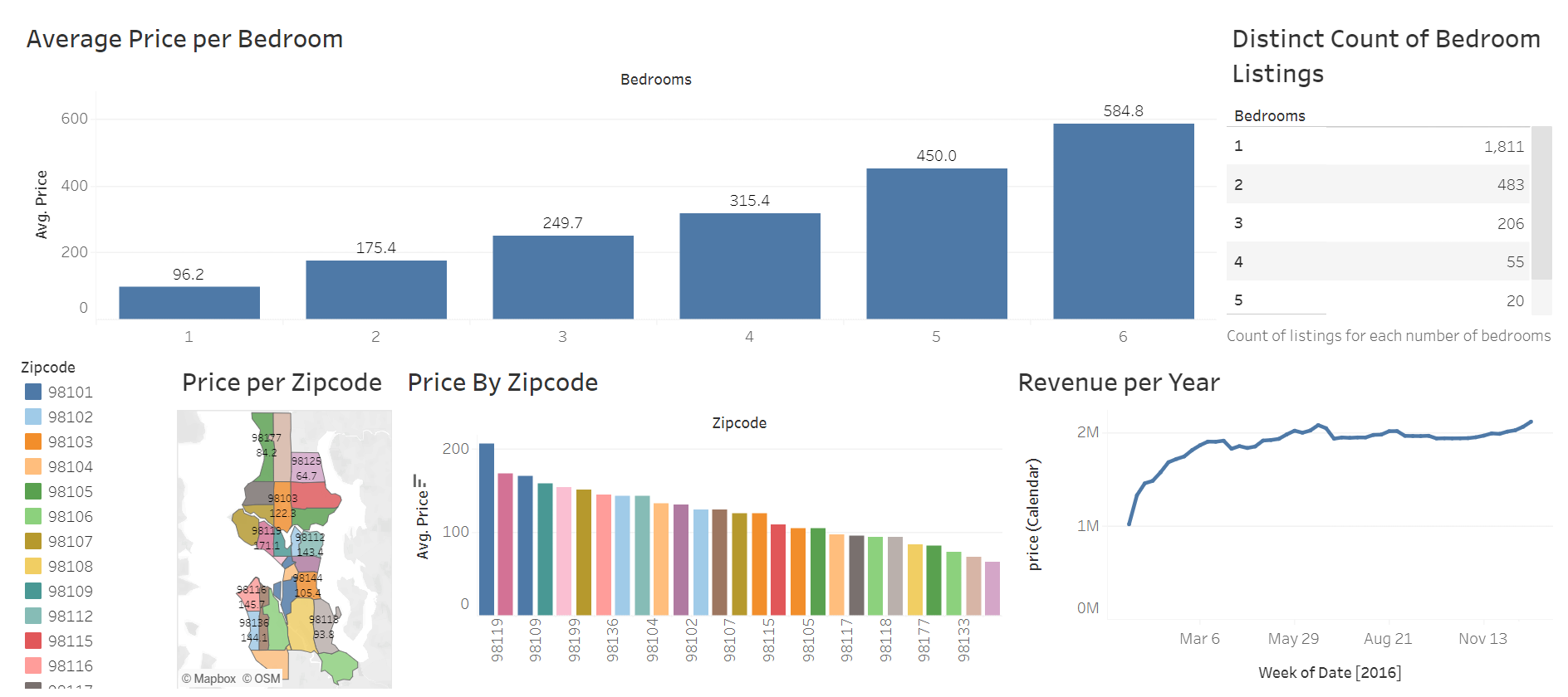
The dashboard displays information about Airbnbs in Seattle, WA. It includes the average listed price per bedroom, the count of listings for each number of bedrooms, the average price by zip code, and the overall revenue generated by all Seattle Airbnbs throughout the year.
How this dashboard can be used
Say you were considering purchasing a house in Seattle to list on Airbnb. I've created a comprehensive dashboard using Tableau to provide crucial insights, aiding you to make well-informed decisions and get the best bang for your buck. The dashboard identifies the most profitable zip codes on average, leveraging both a bar chart and a map, facilitating strategic property selection. Additionally, you can analyze the average listing price per bedroom through a detailed bar chart, and assess the distribution of listings based on bedroom counts to fine-tune your pricing strategy. For property owners considering seasonal listings, the dashboard includes a line chart that reveals revenue patterns throughout the year. This information highlights peak earning periods, particularly during the summer and holidays, offering valuable insights for planning and maximizing profitability.
This dashboard is one example of how Tableau is a powerful data visualization and analytics tool.